Monday, 11 June 2012
Presentation Poster
My final poster design - it's a little bit cramped but I wanted all of those images on there.
The building also took on a name during the poster making process - AIRED Biomimicry- Australian Institute of Research, Education & Design of Biomimicry. This simply came from me needing a bolder heading to stand out from all these drawings, but the idea has really grown on me. Especially as a landmark, I think its important for such buildings to have some kind of a 'name'. GOMA is sort of an example of this. I guess it also kind of works on another level as well, AIRED in terms of generating knowledge and awareness of Biomimicry. Just the presentation to go now.
Elevations
 |
| Eastern Elevation |
 |
| Southern Elevation |
 |
| Western Elevation |
Sunday, 10 June 2012
Renders
I've been spending a lot of time on photoshop lately, although it's nice to finally have some results. Below are a couple of renders that i've just finished. Base renders were done in sketchup, but pretty much everything was re-done in photoshop.
This image shows the internal passageway which is something that I don't think i've described well enough. It's intent is to be an inside/outside space. Above it, the green roof twists around half closing it in, and at each end the green curtains drape down, filtering the light. It will be a space with interesting and frequently changing lighting, walls around it but not above it, and large openings at the end of each path. As well as this, the large supports for the green roof above are to be overgrown with bromeliads and plants, creating an almost tropical - jungle feel. Above the glass doorway a projection will be cast onto the concrete wall, adding to the changing lighting and activity, with large images shining above you walk into the main public building.
This shot just shows the building cascading upwards to the top of the cliff, and the entrance into the main public building.
Just a quick render to show some of the city context behind the building, and also the minimal impact on Bowen terrace. My intent here was to have the building just poking up over the top, so that anyone on Bowen terrace would just catch a glimpse of it, and be intrigued and drawn towards it, to then look over the edge of the cliff to a great undulating green roof inviting them down to the waterfront, into the Howard Smith Wharves.
Floor Plans
I've been playing around with the floor plans trying to figure out the most space efficient way of presenting them, and I think i've settled on this:
I haven't put too much detail in these in terms of interior fit-outs, instead i've just named each rooms purpose. I think this just results in a cleaner look, and i'm not really sure how much detail is required since they are primarily presentation floor plans
Saturday, 9 June 2012
Sections
I've produced these two sections which actually took surprisingly little time. I've never used sketchup before, but the section tool in it is amazingly easy to use, and generate decent results from with little work.
I've been trying to reflect my intent for the lighting in each sectioned room through shading. Section B - B also shows the aviary really well, which i've been having trouble capturing. It also shows the interior pathway's form really well.
I've been trying to reflect my intent for the lighting in each sectioned room through shading. Section B - B also shows the aviary really well, which i've been having trouble capturing. It also shows the interior pathway's form really well.
Diagramming
I've been working on some diagrams that I want to use in my presentation to clearly display how the building form has literally been sculpted by the site analysis, as I think this is a pretty important aspect of my design - that it is actually considered and not just a wayward form.
 |
| This diagram shows the progression of the public building on the waterfront, and how it evolved from a rectangular box to a warped trapezoid shape, dictated by the sun paths. |
 |
| This diagram shows the 3 core buildings underneath the green roof, and their purposes. |
 |
| I really like this diagram, although it's pretty rough. It shows how the solar area is directly reflected in the building form. I think this also fits my vine concept pretty directly as well. |
Thursday, 7 June 2012
3D Modelling Progress
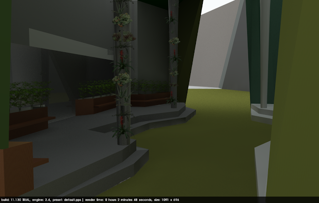
My time has mostly been spent on fixing up the model to a finished product including modelling all of the stairs where the slope is too steep for a ramp, and ensuring glass railings line the sides of the green roof. I've also been playing with rendering programs after taking my model from rhino into Sketchup. Below are a couple of test renders that i've been working on.
There's a lot of post processing work to be done on photoshop, but i'm pretty happy with how the views turned out. I've also been working on pulling out some elevation and section renders, which are below.
There's a lot of post processing work to be done on photoshop, but i'm pretty happy with how the views turned out. I've also been working on pulling out some elevation and section renders, which are below.
Perspective Sections
Section
Eastern Elevation
Western Elevation
Northern Elevation
Once again, lots of photoshop work to be done on these drawings
I've spent a bit of time thinking about diagrams as well, although none have really been resolved well enough to be uploaded.
Subscribe to:
Comments (Atom)


